6 Examples of How to Use a Handwriting Font in Your Donor Comms
A bit of handwriting can feel almost human to your donors. Here are 6 simple ways to use it.
I’ve always loved typography...
...but lately I’ve taken it to a new level.
I've gone down a rabbit hole of books, online course materials, and YouTube videos.
For me, typography (the art of arranging letters on a page) is like Lay’s potato chips. Once you get a taste, you just can’t stop!
So I'm now in the habit of noticing and taking photos of words in the wild. Here are a few recent ones for you:
|
|
|
|
|
|
The beer glass font choice is excellent. The formality of a typewriter font colliding with a crass message really helps land the joke. 🤣
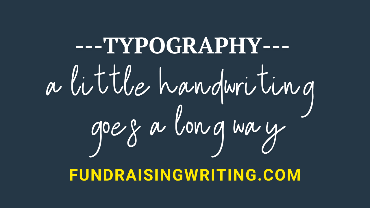
In fundraising, a handwriting font can have a similarly powerful impact.
Think about your average donor. Statistically, they are in their mid-60s. They grew up before cell phones and the internet, when often you picked up pen and paper if you wanted to stay close to someone.
Brett and I are Gen Xers, and we feel the pull of handwriting fonts too. We wrote back and forth to each other during our high school and college years! Here’s a glimpse of our ginormous bin of letters.
|
|
When an older donor sees a bit of handwriting on one of your communications, it’s likely to evoke for them countless warm, fuzzy feelings of nostalgia.
Studies like this one show that handwriting fonts have an effect that can be nearly as powerful as the human touch. Which makes people more likely to donate.
Still, you wouldn’t want to write a whole donor piece in a handwriting font. It would probably not feel authentic. And it would be hard to read. Think of handwriting fonts in the way you think of headlines or pops of color. A little goes a long way.
Here are:
6 examples of how to use a handwriting font in your donor comms
To help your donors feel more connected to your cause (and therefore more ready to give):
1. Gratitude message in a donor newsletter
This one looks like a quick note written on a Polaroid picture. (Handwriting font: Journal)
|
|
2. Call-to-action area on a website
This screenshot shows the newsletter signup form on our website. You can add a handwriting font (and maybe some identity language) to your site, too! (Handwriting font: Sweet Belly Script)
|
|
3. A message at the top of an appeal
This note draws attention to the matching funds offer. (Handwriting font: Million Dreams)
|
|
4. A nudge on a response card in a direct mail appeal pack
This short message is intended to guide a giving choice. (Handwriting font: Fave Script Pro)
|
|
5. Page trail marker
This helps guide the donor through an appeal letter in a personal, inviting way. (Handwriting font: Rollerscript)
|
|
6. Photo caption
This transforms a polished description into something a staff member could have jotted down for the donor. (Handwriting font: Marydale)
|
|
By the way, I’m a big believer in adding a handwriting font to your brand guidelines. Most of our clients have one. You should too!
-Julie
The Fundraising Writing Newsletter
Every week we send a letter about fundraising, writing, donors, and life to smart fundraisers like you.
We share fresh, practical donor communication tips and resources... and some silliness too.
It’s free. Unsubscribe whenever you want.
We love when good things arrive in our inboxes. If you do too, subscribe today.